


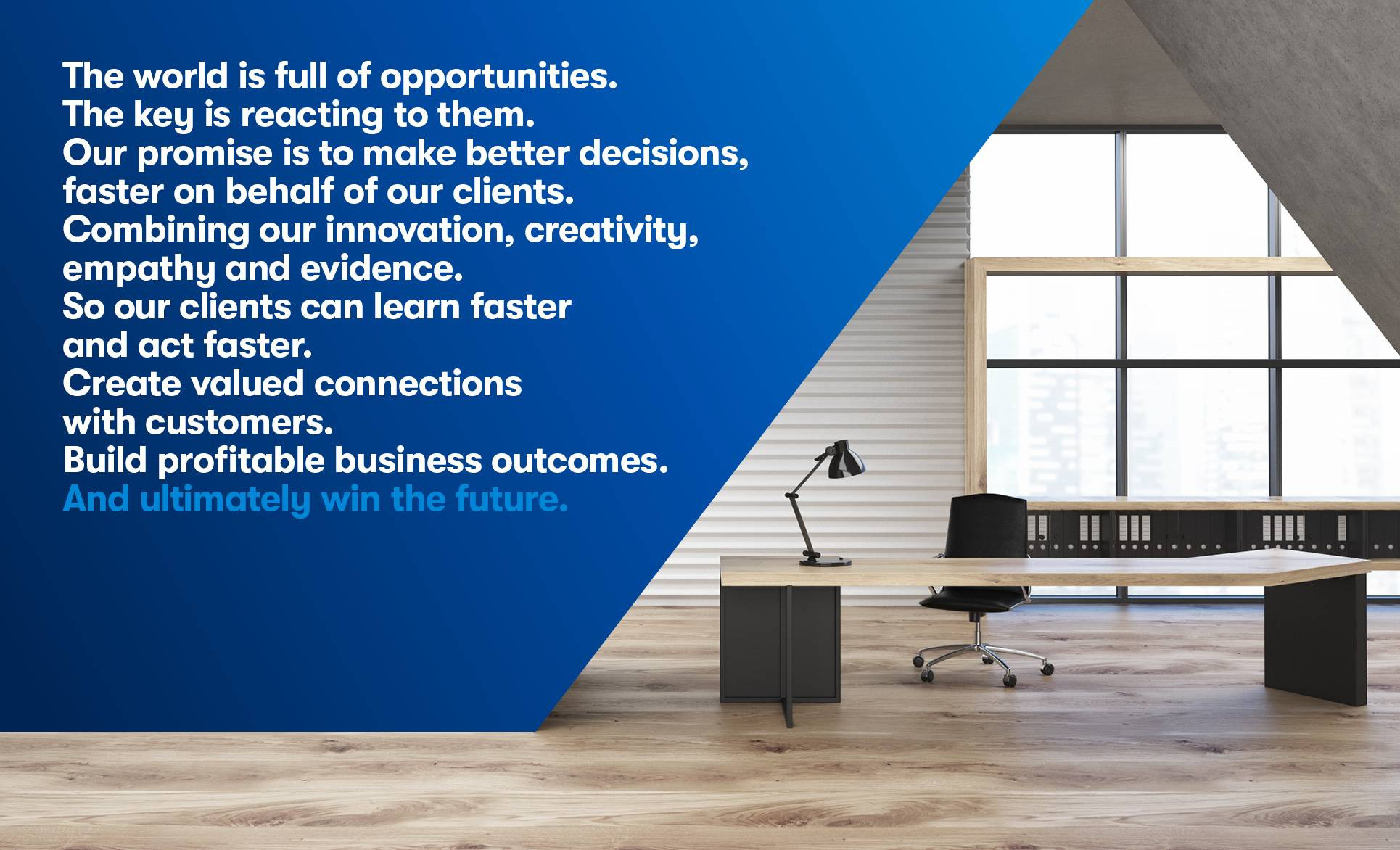
Promise
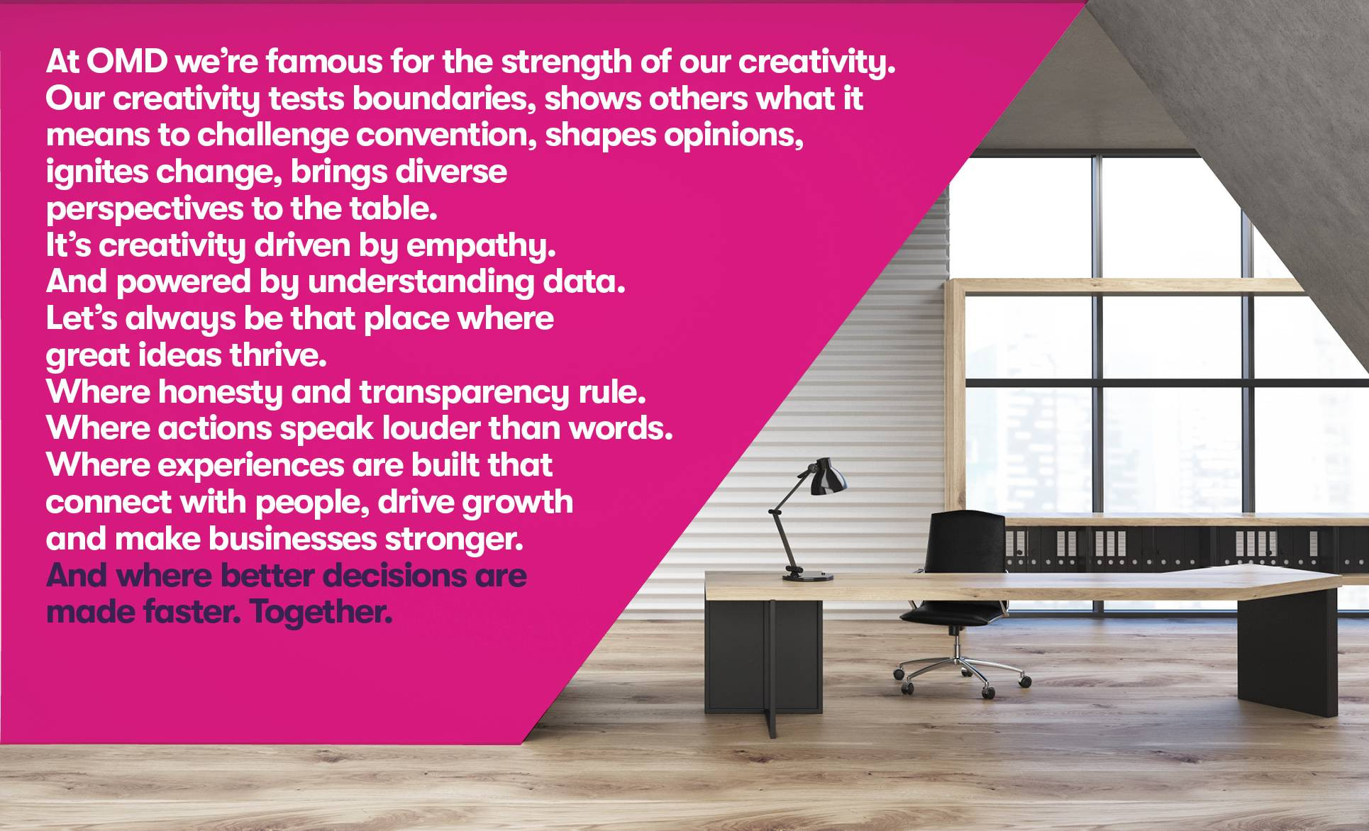
Manifesto
Logo
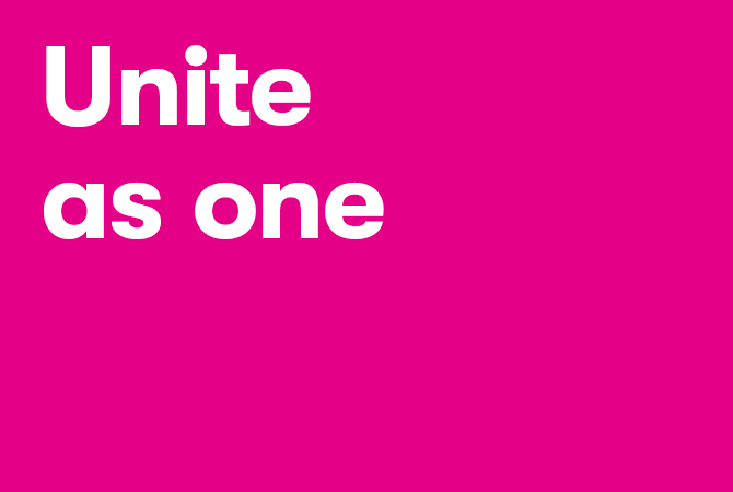
Tagline
Device
Color
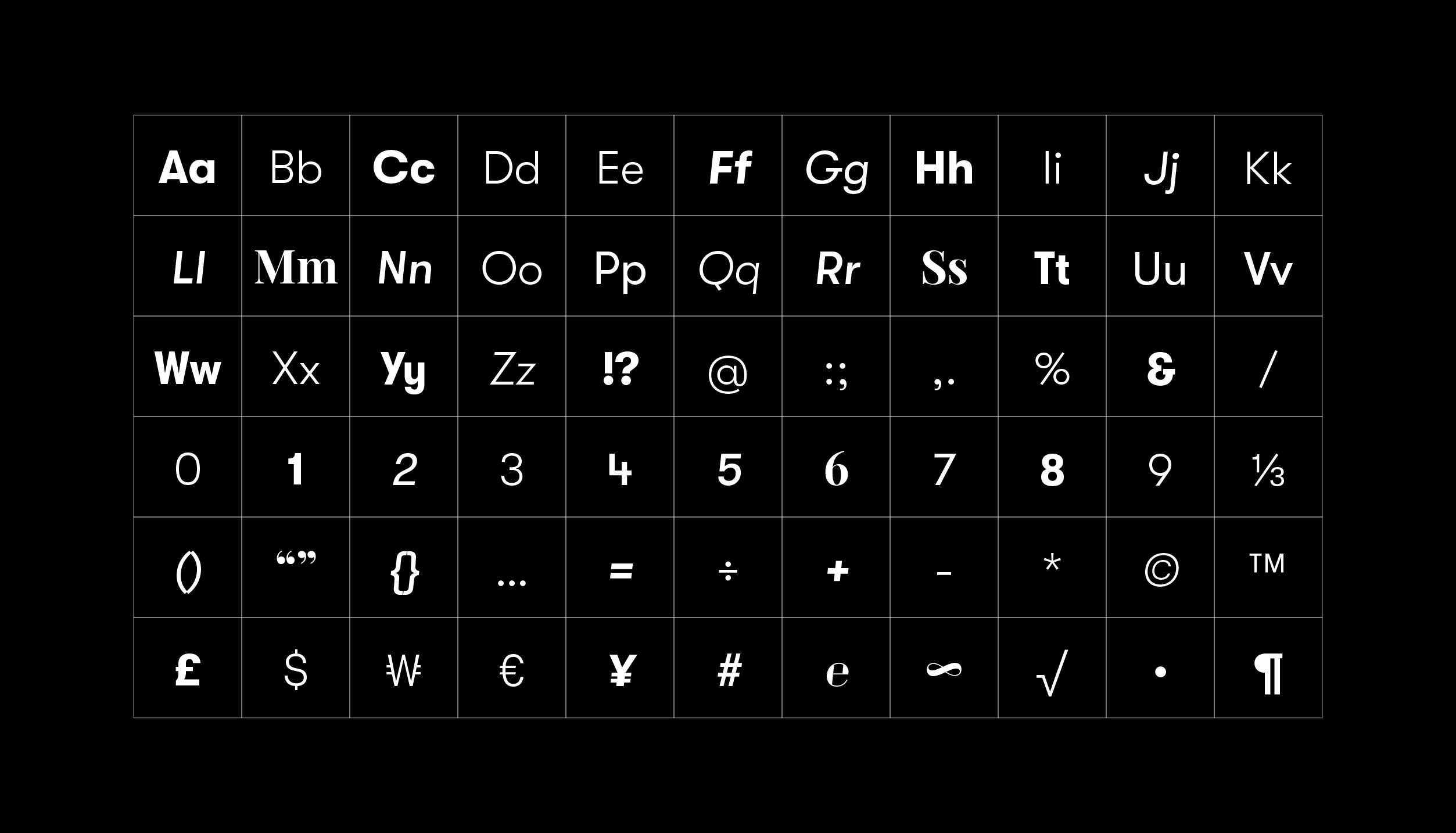
Typography
Photography
People
Headshots
Culture
Background
Motion
Animation
Infographics
Tone of Voice